Website overhaul for two merging companies

Year
2025
Client
Cythera Cyber Security & Bastion Security
Role
Lead Designer across
Brand, Website Build & Strategy
Deliverable
Turned information overload into a clear user journey across two merged businesses

How I was successful

Led multiple workshops with stakeholders from two merging companies to define a unified brand and site direction.
Designed a modern, user-first website with a clear, needs-based content structure.
Built and maintained a light/dark mode design system for consistent, accessible UI.
Rebranded two major security firms into one, retaining elements of each brand, while supporting a future merging of two websites.
Created a detailed content plan connecting design and content teams to streamline production.

Challenges Overcome

Aligning stakeholders across two merging companies through 8 in-depth workshops over 8 weeks.
Reconciling conflicting opinions on website goals, priorities, and brand direction.
Designing a site that effectively served both Australian and New Zealand audiences with distinct user needs.
Managing tight timelines while keeping the project on track and maintaining design quality.
Leading and mentoring graduate designers to ensure consistent and accurate implementation of design work.
Shifting from a simple service directory, to a user-focused content approach by introducing a section that addressed customer pain points directly - matching their problems with relevant solutions.

Key Learnings

The importance of managing time effectively and ensuring all additional work was scoped and billed correctly to maintain project profitability.
How to interpret complex service offerings and translate them into clear, digestible content for users.
The value of having the right stakeholders involved early to speed up alignment and decision-making.
The need to proactively guide clients through content planning and asset collection, the project doesn’t stop at the end of the design phase

one

Two security companies had merged but lacked a unified brand or digital presence

two

The merger resulted in new services needing to be clarified across both businesses

three

The existing websites failed to attract new leads or perform in organic search.

Business Problem

Two major security companies were merging, requiring the creation of a unified brand and digital presence. The website project served as a starting point to bring both teams together and generate internal excitement around the new brand.

One

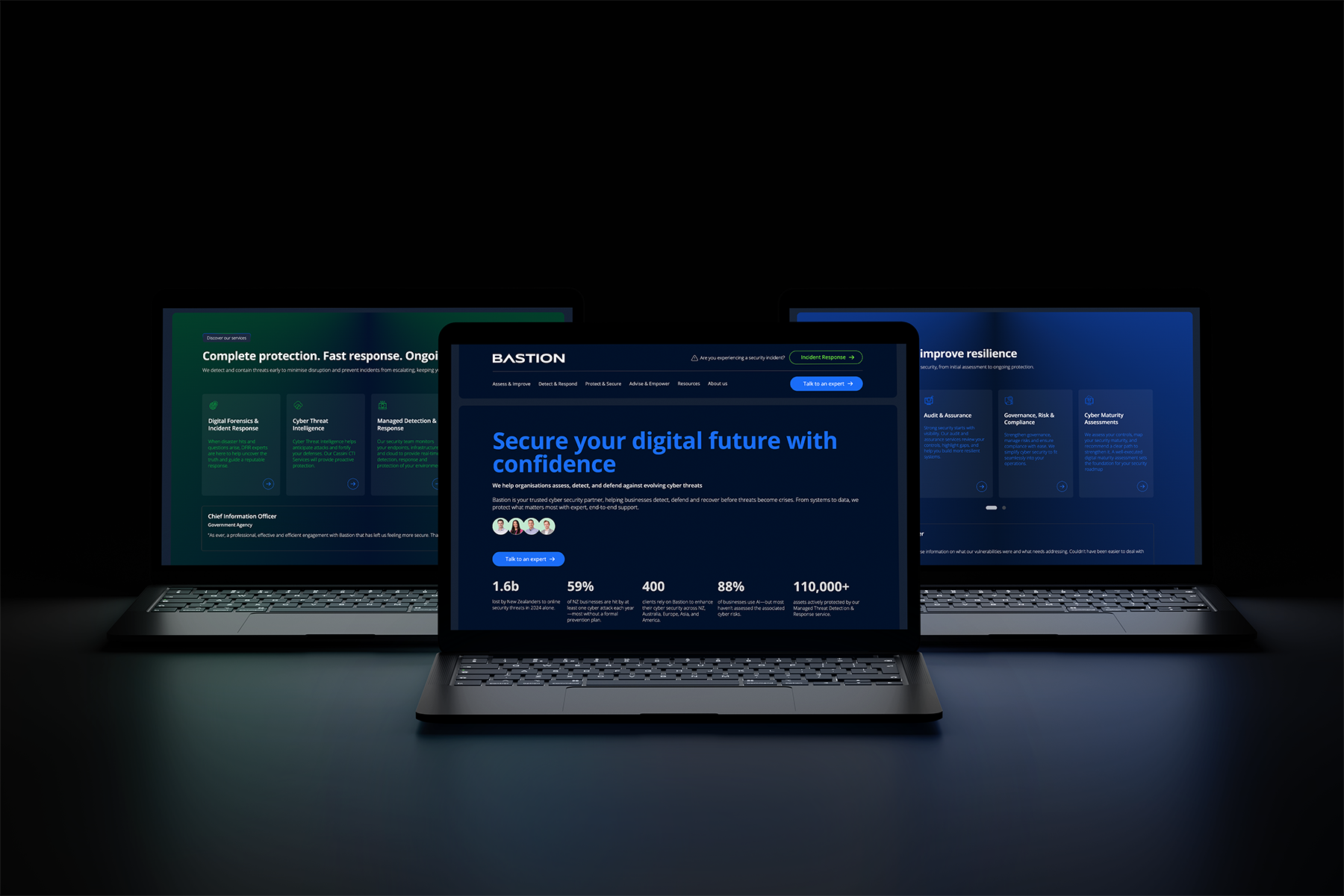
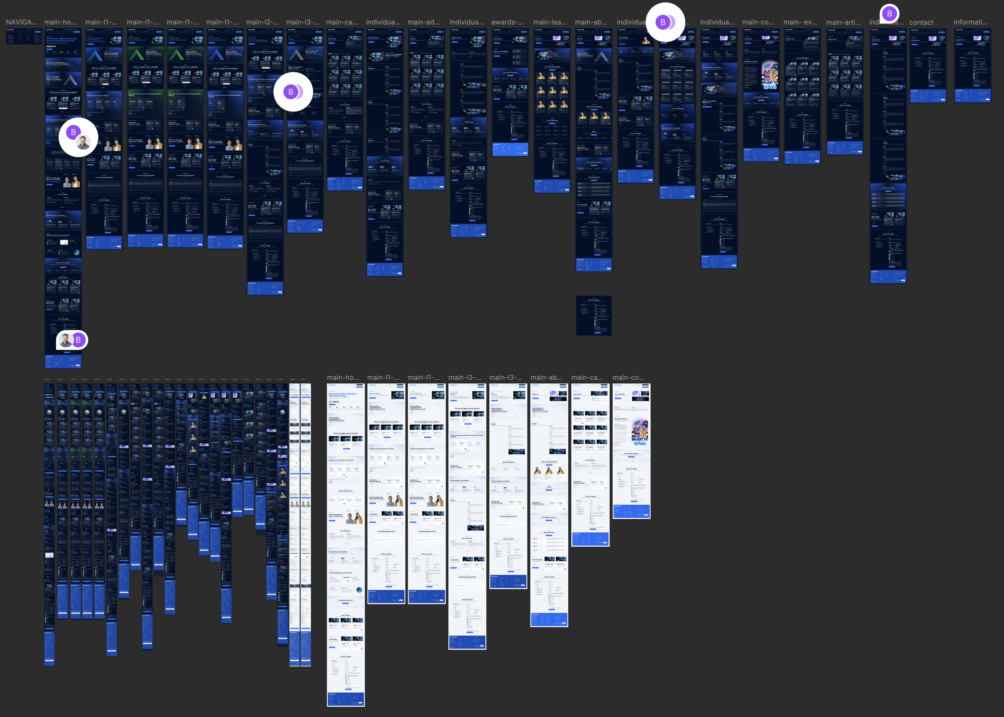
Designed two websites with consistent branding, tailored to different service streams.

Two

Built a flexible CMS for easy client updates across services, blogs, and team bios.

Three

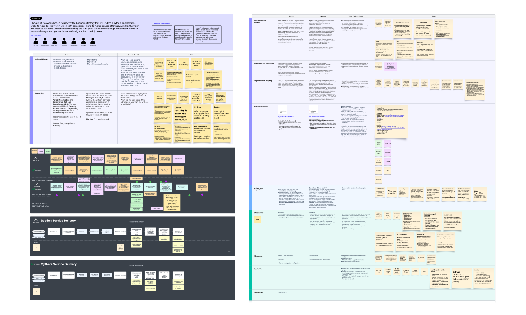
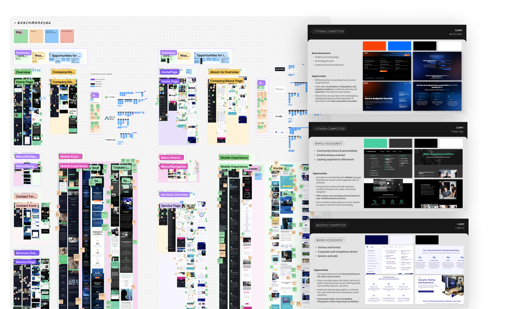
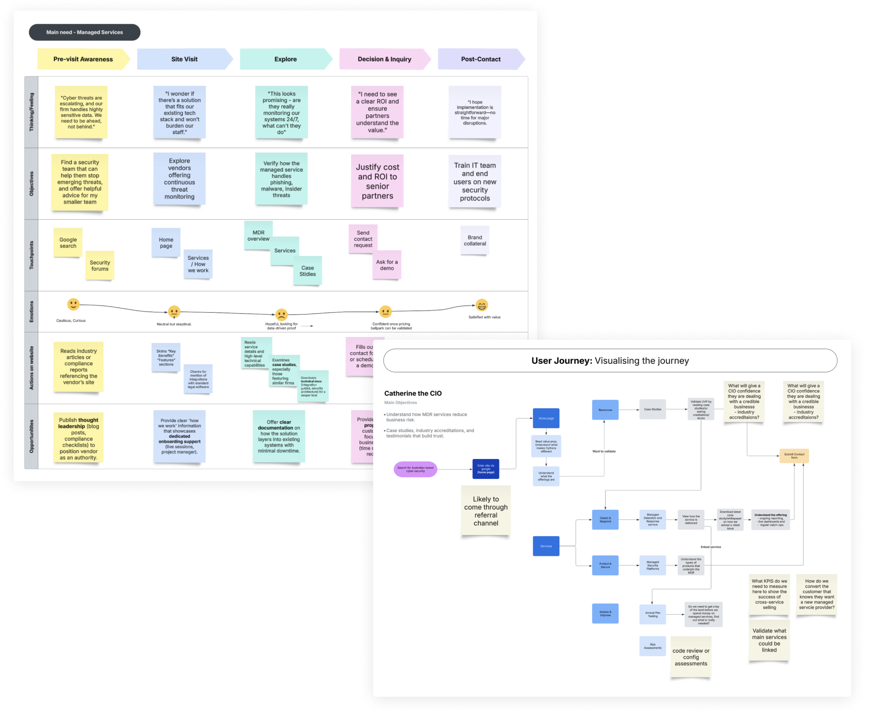
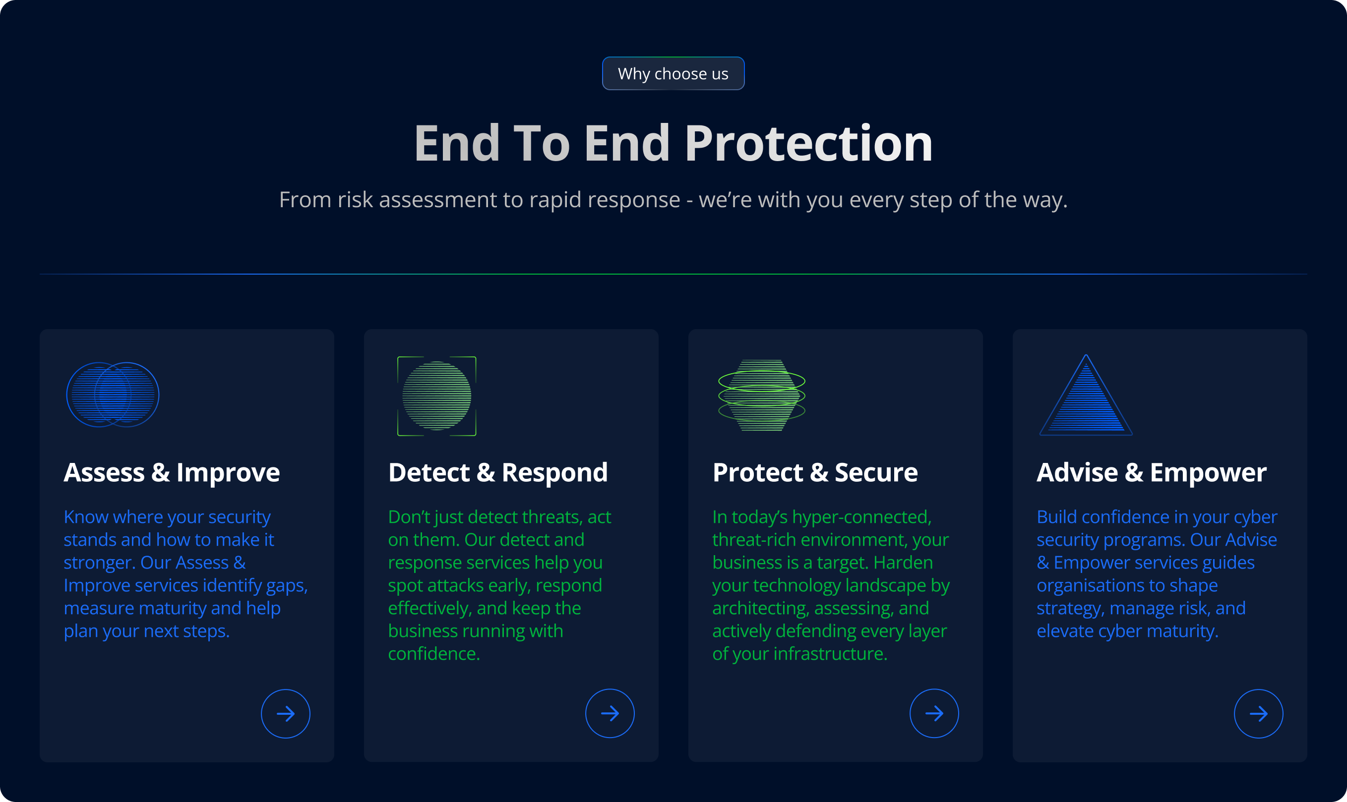
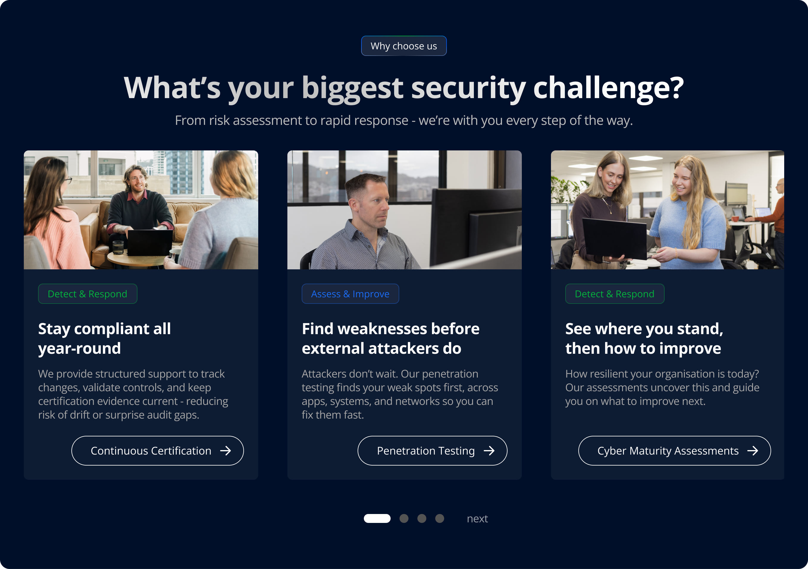
Created clear user flows and content blocks aligned to user needs.

Measuring Success

As Lead Designer, I was responsible for translating complex service offerings into a clear, engaging dual-website experience - balancing brand consistency with tailored content strategies for two distinct audiences.

Project Roadmap

Workshop discovery with four key stakeholders

We began with a two-hour workshop facilitated by myself toclarify the brand’s positioning, future vision, and website goals.
A key challenge was aligning two merging businesses on a unified direction and determining how to represent their distinct services clearly.
Both existing sites lacked a clear value proposition, making it difficult for users to understand what the businesses offered and who they served.

Website
bastion_discoveryworkshop
Define

Benchmarking reveals a need to present the humanistic elements

I conducted UX benchmarking across six competitors in the NZ and AU markets, analysing how services were structured, communicated, and visually supported.
The research revealed a common gap: most competitors were highly tech-centric, with little emphasis on user needs or clear value propositions.
Attempts at a ‘human-led’ approach often felt either too DIY or overly corporate, lacking authenticity. These insights helped us shape a balanced, people-first experience that communicated credibility and care.
Define

Ensuring we measure against the right metrics

With access to the client GA account, working with the SEO manager to assess the findings, we were able to gather high-level insights that would help us benchmark the new site, the insights included;
  • Considerable more direct traffic than organic, suggesting that keywords were not used correctly on the site
  • Inability to measure effectiveness of lead generation, as there was no contact form - only a listed number to call.
  • 'About us' page had the most hits after home, suggesting a high need for users to seek out trust signals
  • Top performing service was ‘Digital Forensics and Incident Response’ suggesting a need for this to be prioritised, as incident response is a time sensitive matter
Brand Discovery

Refreshing the digital branding to represent the new 'sister' brand approach

Tasked with unifying the digital presence of two sister brands, I led a branding refresh that balanced both companies’ identities - Cythera's bold green and Bastions trusted blue - into a cohesive digital strategy.
Initially, the brief was to move away from the existing dark-mode sites and introduce a brighter, more accessible brand. Through stakeholder workshops and presentations (including both CEOs), I helped uncover a shared brand direction that respected the heritage of each company while looking forward.
The outcome was a flexible brand system and website design that supported both light and dark modes, driven by user preferences and accessibility best practices. While the project was fast-tracked to prioritise go-live dates, emotional investment from each stakeholder extended the brand exploration phase. I adapted quickly, managing scope creep and navigating conflicting opinions to keep momentum while delivering a digital identity both teams were proud to stand behind.

bastionsiet-humanledsection
Insights

Ensuring a clear point of difference by mapping user journey's

I championed a human-led ethos, identified by both companies as a key brand differentiator, and worked closely with content creators to ensure the copy highlighted the real people behind the services.
Competitor benchmarking showed most sites were overly tech-focused and lacked this relatable presence. To balance this, I developed user personas and journeys, including ad-hoc testing with IT users, which informed a site structure that retained technical terms to build trust, showcased partner badges and certifications, and emphasised on-shore support as a key differentiator—positioning the brand as approachable, trustworthy, and user-focused.
bastionsiet-humanledsection
Build

Structured services that support a users mental model

One of the key challenges was merging both businesses’ offerings into a single, simplified top level structure. The benchmarking revealed the need to reduce complexity - while the audience was mostly tech-savvy, services still needed to be understandable to those unfamiliar with security jargon.
I restructured the offering into four clear categories, such as "Assess & Improve" and "Advise & Empower", reflecting the natural split between the two businesses. Technical labels like were replaced with language that aligned better with users’ mental models and how they think about securing their business.
Build

Targeting user pain points

I championed a section specifically addressing user pain points, aiming to simplify complex security processes for all users.
The goal was to move away from a long, alphabetical service list, instead focusing on the most common audience challenges in a three-card carousel.
I presented this to the client, with aims to get them to understand how this approach would help their users match their problems with the right service - providing less reliance on understanding complicated service name jargon.
The client agreed, and wanted their top services that produced the most revenue, listed as the first three cards in a carousel. I was able to guide them into thinking more about the user journey - suggesting instead to list services that users enter the business on, targeting those new users that may be experiencing a sercurity breach and need advice, as opposed to a retainer service that created high revenue - but would perhaps not be at the top of the new users mind
Project Management

Taking charge of the content plan

I went above and beyond in this project, particularly in managing the complex content requirements. With the two companies merging and new services being introduced, content management became one of the biggest challenges.
Our content team was only responsible for 20% of the content, however in order to build the site and insert all content within the time contraints we needed a simple way to collect information from both companies.
To solve this, I created a shared document that clearly outlined the exact content needed for each page. This document was distributed to both companies and then handed directly to our developers, enabling them to import the content efficiently.

contentplan-googlesheet-websitebuild
Final Designs

Building hi-fi designs utilising variables

I completed the high-fidelity designs within one week, working closely with the content team to ensure each section could accommodate the exact amount of content needed.
To support the two colour modes, myself and a junior designer built a comprehensive design system in Figma, creating components with multiple variants and setting up detailed variables for colours, typography, and spacing.
I made sure we established clear naming conventions to keep everything organised and consistent, which made it easier to manage and update the design across both themes. This structured approach ensured efficient handoff to developers and maintained design integrity throughout.

Unique Value Proposition

Light-Dark modes

The client wanted a light and dark mode that would match user browser preferences. At first, I suggested holding off to avoid diluting the new brand and confusing users.
But when they decided to go ahead, I took charge of the design system, guiding the junior designer in creating both colour modes. We developed the light mode palette and made sure every element had matching variables for each mode.
The light and dark mode feature was definitely a feature that pushed the dev time up in the project. Although all variables were mapped during the design phase, they weren't always implemented accurately in the build, requiring additional QA to ensure fonts, background colours, and interactions rendered correctly in both modes.

Next Steps

Facilitate CMS training

Support for both companies in how they can update the CMS collections on their end, with low level support needed from our teams going forward. This will involve live training, as well as supporting with training videos

Provide post-launch support

The launch of the sites will provide the businesses with a launching pad into their next phase of collaboration, the importance of ensuring all pages have URL redirects set up, and is tested thoroughly before making announcing the change - will greatly impact how their brand is seen in market

Benchmark against previous sites

We ensured that we took a detailed analysis of the companies GA, before we began this project. In a few months time we will be able to quanitfy the changes we have made
Final Notes
This project gave me valuable experience in balancing business needs, stakeholder perspectives, and developer constraints.
I stepped into new responsibilities, including facilitating cross-functional meetings and aligning business goals with user needs. This strengthened my confidence in leading collaborative decision-making and finding pragmatic design solutions.
From running brand discovery workshops to validating flows and building the brand as well as designing every single unique screen, I refined my ability to translate strategy into user-centered design.
The dual-brand site also gave me a chance to explore flexible design systems, accessibility, and personalistion through light/dark mode preferences.
Next Project

View next project